Key takeaways
- Your tea packaging design should use bold, strategic colours to improve shelf visibility and help consumers quickly distinguish between products.
- Clear and prominent logos can strengthen brand recognition and long-term loyalty.
- Your packaging should also include concise but meaningful product details, such as origin and flavour notes, to build trust.
Your tea packaging is more than just a simple container. In many cases, it’s also a silent ambassador for your business. It can communicate quality, heritage, and key tea information to consumers, helping them make quick decisions in crowded retail environments. However, your tea packaging design needs to meet all of these requirements to truly stand out.
Effective tea packaging must balance visual impact, product protection, compliance, and clarity of information, all while staying true to your identity. It’s not an easy feat, but careful planning, testing, and feedback loops can streamline your process.
To understand what makes tea packaging stand out in 2026, I spoke to Girjesh Rungta. He is the founder and Managing Director of Rungta Tea, an Indian company that sells premium tea in durable plastic pouches. Read on to find out how his team approaches colour, design, and product communication.
Subscribe to our weekly newsletter
Sign up
#1. Use bold colours to boost shelf visibility
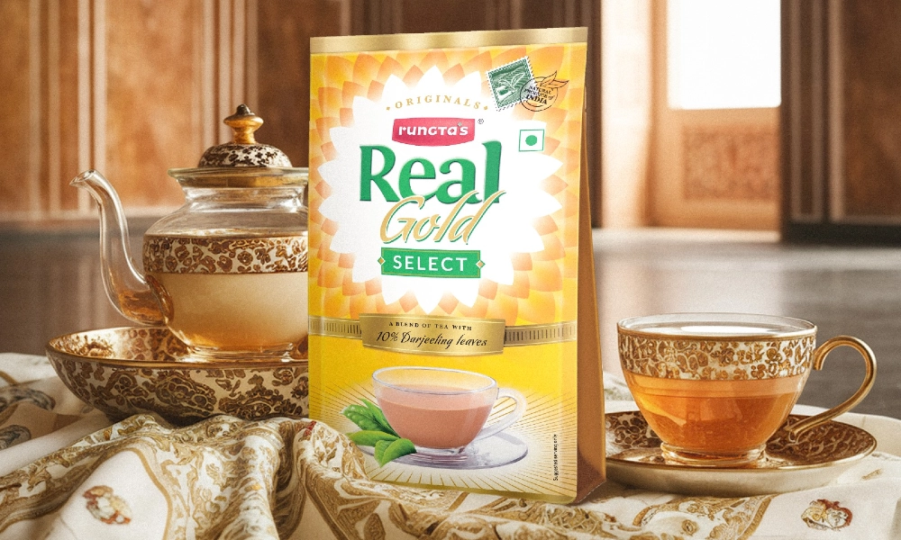
In crowded retail aisles, strong colour choices can make all the difference. For Rungta Tea, colour plays a strategic role in signalling both product type and brand identity.
“Our colour decisions are driven by three primary considerations: segment differentiation, shelf visibility, and flavour communication,” Girjesh tells me. “Retail environments are visually dense, and strong, bold colours ensure immediate recognition from a distance.”
For Rungta Tea, each colour represents a different product. “Colour selection is never arbitrary,” he says. “Each variant is assigned a distinct palette that reflects its strength profile or regional association.”
For instance, Rungta assigns deeper, richer tones to stronger Assam tea blends, while lighter or premium variants receive more refined palettes. This supports the twin goals of visibility and intuitive understanding.
It’s a wise decision because bold colours on packaging have a psychological impact beyond visibility. The colour and shape of packaging can elicit emotional responses, which in turn can influence a consumer to buy a product. For instance, bright colours tend to evoke positive emotions such as interest and excitement, while neutral or dark colours give an impression of elegance.
Therefore, tea packaging that leans into colour choices can perform two roles. It can both draw the eye of consumers and reinforce the sensory and emotional cues of the product itself.
“The goal is to balance shelf impact with clarity, so consumers can easily distinguish between variants while reinforcing brand recall,” Girjesh says. “Given that we primarily use laminated pouches, colour vibrancy and print consistency are critical to maintaining visual quality across production batches.”
#2. Easily identifiable logos and designs
While colour attracts attention, thoughtful tea packaging design ensures that product information and messaging don’t get lost in a sea of visual noise. Therefore, your designs should be clear, memorable, and representative of the tea’s characteristics.
“Our packaging design is guided by core principles of clarity, compliance, and trust visibility,” Girjesh says. “All labelling is developed in strict adherence to FSSAI and Tea Board of India requirements, and vivid, accurate product imagery further aids communication of product type and strength in a competitive retail setting.”
For instance, all of Rungta’s tea packaging designs show a cup with the brewed tea inside, alongside tea leaves to represent the product’s origin. “These serve as important trust signals, and their placement is carefully considered during every artwork development process,” he explains.
In this sense, it’s also important to feature your logo prominently on the tea packaging. This way, consumers who are satisfied with your products can easily remember your brand for the next time they purchase. “On the design front, we prioritise strong brand identity and clear variant differentiation, ensuring consumers can recognise and distinguish products at a glance,” Girjesh says.
Evidently, your tea packaging design should beboth visually compelling and compliant so consumers can identify your product at a glance.

#3. Add specific product details
Effective tea packaging design shouldn’t just look good – it should also educate consumers on the tea to help them understand its origin and background. Rungta’s tea packaging design focuses on including key product information that enhances purchase confidence without overwhelming the design.
“We believe packaging should offer consumers both transparency and clarity,” Girjesh tells me. “Where relevant, we reference the origin of the tea, such as Assam or Darjeeling, particularly when provenance defines the product profile. We also include brief descriptors covering flavour notes or strength indicators to support informed purchase decisions.”
However, your tea packaging design should also meet regulatory requirements. “All mandatory information is clearly displayed, including net weight, MRP, MRP per gram where applicable, date of manufacturing, expiry details, batch information, statutory declarations, and required certifications,” he says. “The objective is always to strike the right balance between compliance, product transparency, and readability.”
However, you can also include additional written information on your tea packaging design to guide consumer choices. “Beyond mandatory information, we incorporate limited but meaningful written elements to strengthen the overall customer experience,” he says. “This includes a short brand message reinforcing our commitment to quality, alongside brief notes on the blend profile.”
That said, it’s important that these added features complement, rather than clutter, your tea packaging design. “We deliberately avoid excessive on-pack storytelling, as space on laminated pouches is limited and clarity must always take precedence,” he says. “Our approach remains functional yet brand-consistent, ensuring the packaging not only protects the product effectively, but also communicates credibility and quality.”
Evidently, the best tea packaging should be both practical and expressive. Your designs need to not only protect the tea inside, but also communicate quality, identity, and trust. The packaging itself often becomes part of the consumer experience, shaping first impressions and influencing purchase decisions long before the tea is brewed.
At MTPak Coffee, we offer a range of industry-leading packaging options for tea. From laminated pouches and printed bags to fully recyclable or compostable formats, we partner with brands to bring their vision to life. In turn, your tea packaging can combine freshness, visual impact, and real-world performance.
Contact the MTPak team to explore tea packaging options tailored to you and your market.
FAQ
Why is tea packaging design so important?
Tea packaging design is often the first interaction a consumer has with your brand. Therefore, it needs to deliver a positive perception, communicate quality, and guide consumers towards purchasing decisions.
What information should I include on tea packaging?
You should include the net weight, manufacturing date, best-before date, and other statutory declarations.
Should tea packaging include origin information?
You can include additional storytelling elements, like origin information, brewing tips, or explanations of the tea’s flavour profile.


