Key takeaways
- Your matcha packaging design should include key details like harvest, origin, and grade.
- While green is the most common colour for matcha packaging design, the most important consideration is to use opaque materials to prevent light from degrading the matcha.
- You should also nitrogen flush your matcha packaging and include add-ons like resealable zippers to preserve its freshness over time.
For coffee roasters and drinks brands, matcha is a significant opportunity for growth and increased sales. Matcha has been one of the fastest-growing drinks in recent years, in no small part because of its distinctive green colour, earthy flavour notes, and high antioxidant content. However, your matcha packaging design needs to be visually appealing and striking to stand out on retail shelves.
Matcha packaging design has evolved beyond purely aesthetics to become an educational tool that communicates value, builds trust, and protects the powder inside. With consumers becoming more invested in quality, your matcha packaging design must balance visual appeal with functional excellence.
To learn more about matcha packaging design, I spoke to Koki S., a Strategic Matcha Sourcing Expert based in Japan. Read on for his insight.
Subscribe to our weekly newsletter
Sign up
What information should your matcha packaging design include?
Your matcha packaging design should communicate key information like harvest, cultivar, origin, and grade. These are the details that consumers look for when assessing matcha packaging.
According to Koki, certain information is crucial for building trust with knowledgeable buyers. “In the premium market, packaging is no longer just a container; it is an educational tool,” he tells me. “To build trust with modern connoisseurs, brands should explicitly list harvest season, cultivar or blend strategy, origin, marketing grade, and certifications.”
He believes that the harvest season is the most critical piece of information to include. “Always specify if it’s ‘First Harvest,’ also known as Ichibancha,” he says. “This is the single biggest indicator of quality and separates ceremonial grade from culinary.”
Next, you should explain whether your matcha is a single cultivar or a blend. “If it’s a single cultivar, such as Okumidori, highlight its unique character,” he explains. “If it’s a master blend, explain that it was crafted by a tea master for balance and consistency. Transparency here prevents consumers from thinking blends are inferior.”
Geographic origin has become increasingly important as consumers develop an appreciation for matcha-growing regions. Rather than generic “Product of Japan” labelling, specific regional designations like Uji, Kagoshima, or Yame communicate authenticity and allow customers to explore different regional flavour profiles.
You should also outline your matcha’s grade to signpost its intended use. For instance, Koki recommends labelling it as “ceremonial” for whisking or drinking or “culinary” for lattes and baking. “This manages customer expectations regarding bitterness and colour,” he says.
In international markets, certification logos serve as powerful trust signals. USDA Organic or JAS Organic designations appeal to health-conscious consumers and can justify premium pricing strategies.
Non-essential but valuable additions include preparation instructions, brand storytelling elements that communicate heritage or philosophy, and social media handles to build community engagement. QR codes linking to brewing tutorials or farm stories can enhance the unboxing experience without cluttering the primary packaging.
Ready to customise your own matcha packaging?
Which colours are best for matcha packaging design?
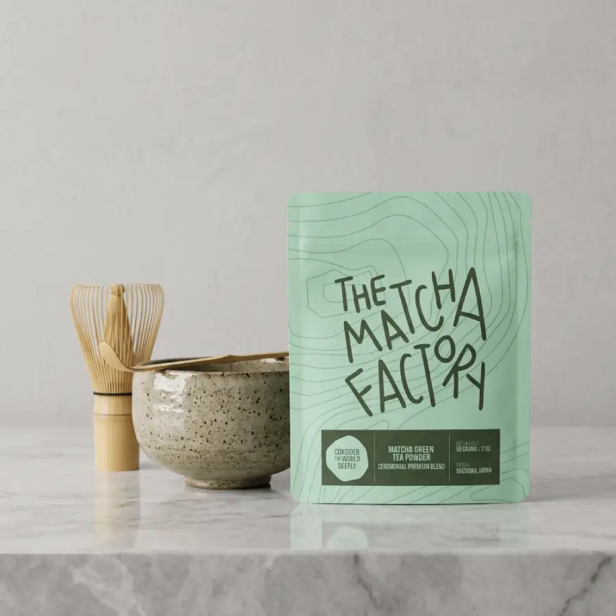
While matcha packaging design is often associated with green hues, Koki believes that opaque packaging is more important than any specific colour.
“Before discussing brand colours, you should address function,” he says. “Matcha has three main contaminants: light, heat, and moisture. Among these, light (UV) is the fastest killer. It destroys chlorophyll, turning the vibrant emerald powder into a dull, yellowish-brown within hours.”
This scientific reality means the best colour choice is any completely opaque option that blocks light penetration. “Also, avoid transparent windows,” he says. “It looks nice on the shelf for one day, but can ruin the product by the time it’s sold.”
Within the constraint of opacity, several colours have emerged as premium choices for matcha packaging design. “Matte black and dark grey are often used for high-end ‘ceremonial’ lines to signal luxury and UV protection,” he says.
Other colours are also suitable, however. “Deep forest green communicates freshness and nature, while metallic or silver is excellent for reflecting heat and light, keeping the powder cool,” Koki adds.
For matcha companies with multiple product lines, colour can serve as an effective differentiation tool. A premium ceremonial line might use matte black packaging, while culinary grades could feature deep green or charcoal grey. This visual hierarchy helps consumers quickly identify their preferred products while maintaining a cohesive brand identity.
Therefore, you can use a range of colours for your matcha packaging design – provided your bags are opaque and light-resistant.

Should your matcha packaging design include add-ons?
Functional add-ons are essential for matcha packaging design. The powder’s texture and sensitivity to oxygen make resealability and air removal critical for maintaining quality.
“Since matcha is a fine powder that oxidises instantly upon contact with air, resealability and oxygen removal are non-negotiable,” Koki states.
One of the most common approaches is nitrogen flushing. It’s especially important for premium matcha grades that travel long distances before arriving with consumers. “Regardless of the package type, the most critical element is nitrogen flushing,” he explains. “Removing oxygen from the bag is the only way to preserve the umami for export.”
Nitrogen flushing works by replacing the oxygen within the bag with nitrogen gas. Unlike oxygen and carbon dioxide, nitrogen is inert, meaning it won’t react with matcha powder to degrade its flavour.
You should also include resealable zippers to preserve the matcha powder between uses. However, since matcha is a fine powder, unlike whole coffee beans, the zipper needs to be very robust. “Standard zippers can fail because the fine powder gets stuck in the tracks,” Koki says. “I recommend Velcro-style or wide-track zippers to ensure a perfect seal every time.”
If you use tins for matcha, especially for ceremonial grades, additional closures are just as important. “For top-tier matcha, an aluminium tin with a pull-tab is the gold standard,” he tells me. “It guarantees a hermetic seal against humidity and oxygen until the moment of opening.”
In conclusion, successful matcha packaging design demands equal attention to form and function. You should make key product details incredibly clear so consumers can choose the right certification or blend for them. Similarly, using opaque materials is crucial for protecting the matcha from UV light. Lastly, you should use add-ons like resealable closures and nitrogen flushing to keep your matcha powder fresh for longer.
At MTPak Coffee, we offer specialised matcha packaging to address these functional requirements while supporting your branding requirements. From fully opaque plastic pouches with zippers to durable and reusable tins, you can combine product protection with distinctive visual design.
Contact the MTPak Coffee team to learn more about our matcha packaging design services and products.
FAQ
Why is opacity important in matcha packaging design?
Opacity is vital because matcha powder is incredibly sensitive to UV light, which can degrade its flavour and cause it to lose its distinctive green colour.
What information is essential for matcha packaging design?
Make sure to include the harvest season, cultivar or blend type, origin, and grade (ceremonial or culinary). You can also add details like brewing instructions or sustainability certifications.
How do I choose the right colour for matcha packaging?
Green is primarily associated with matcha packaging design, communicating its freshness and natural origin. However, matte black and dark grey are also suitable for high-end ceremonial matcha.